Interview: Cameron Bird, Architecture in Helsinki
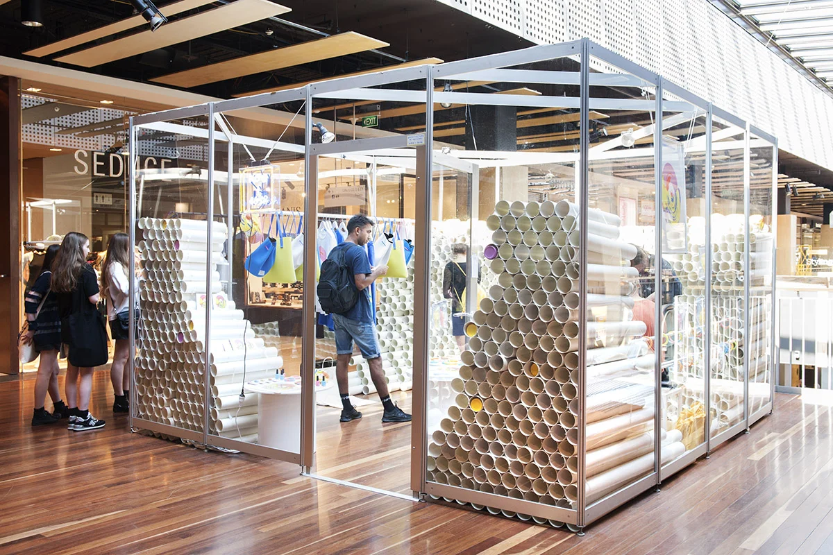
Arguably one of Australia’s most beloved dance-pop acts, Architecture in Helsinki has long held a reputation for breaking new ground with every one of their record releases. To coincide with the release of Now + 4EVA, the quintet have launched a unique pop-up retail space in the Melbourne Central shopping complex, where visitors to the space are invited to interact with the band, listen to the new album and, of course, buy.
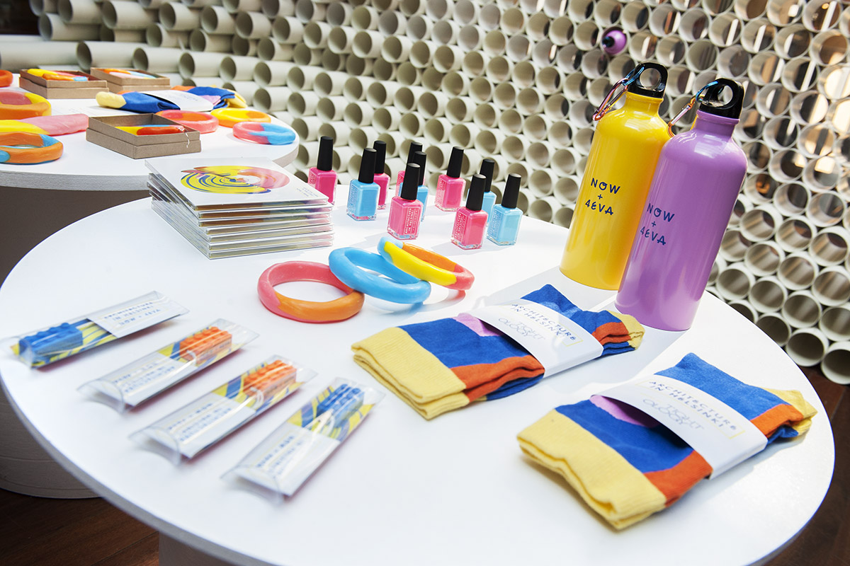
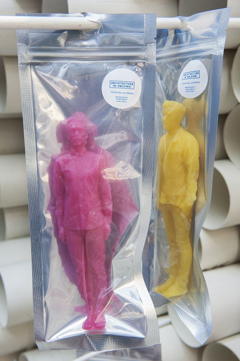
Built by local architecture firm, Sibling, the NOW + 4EVA Concept Store features a capsule collection by Kloke, accessories designed by Witu and Dale Hardiman, 3D Architecture in Helsinki lollies by Lucy Mcrae and Red Balloon, nail polish by Kester Black and socks by Tightology. The pop-up space promises (and delivers) great quality, locally designed band merch.
Makers of Melbourne had the pleasure of spending an autumn evening with lead singer Cameron Bird, who took us through the concept and inception of the space.
The idea for your pop-up store is great. It’s one of those concepts that sounds so simple, it makes you wonder why no one has ever done it before.
Thank you that’s very flattering. It’s strange to me that no-one has done it before. It’s definitely treading new ground. I feel like people in design and fashion are getting it more than people in music are: people in music are a little bit more confused by the concept.
Because we’ve all come from art backgrounds it doesn’t seem that crazy to us and there’s definitely people in music who think it’s a cool idea. But I also think that there're a few people who think that we’re taking away from the music; people who see it as more of an entrepreneurial exercise rather than seeing it as a great time capsule piece for us as a band.
It’s interesting that you say that because I know a lot of musicians with art school backgrounds. A majority of musicians seem to come from creative fields.
Of course and I think that a lot of what we’re trying to rebel against is that archaic idea of “you can sell your albums at JB Hifi and your digital music will come from iTunes". It’s a pretty limiting and suffocating place to live as a creative person. We wanted to try something that would bring our music to life. It [the space] brings people together and gives them something to talk about. We wanted to create something that was positive and fresh.
You’ve always had a hand in the creative process, though, designing album covers and the like.
We’ve always been across all of our visual output, whether that meant collaborating on videos or doing cover art. We have a lot of friends who work in the fashion and art fields. As a band that was a world that we really wanted to be aligned with, rather than being one-dimensional. It made sense for us to make the most of our connections.
How did you come up with the original concept?
It was about four months ago and we had free time between the recording process and release date. I had this idea where I wanted to do something that set our album apart from the hundreds of records that are released every week. I was wondering how you made an album feel like it was tactile, that people could fully experience. We wanted to make the launch personal for our audience. In a way it was also designed for people who had never heard of our music before, hence picking Melbourne Central as the location – we’ve already had a lot of people who are just curious as to what is going on in the space and come in with a really open mind. As a band we like the idea of someone who doesn’t know who we are stumbling across the space and discovering the music through the immersive retail environment that we’ve created.
How did the ideas for what you were going to sell in the store come together?
It was pretty free form. I initially approached designers that I liked or knew socially. There was no real rationale behind it, apart from the fact that we wanted to work with designers that we felt made good quality products and were made locally. It sort of just came together over a one month period and everyone that I approached said yes. Obviously it was an insane amount of work.
We pulled it all together really quickly and products were still being made on the day of the launch so it was down to the wire. We were flying by the seat of our pants. There were points when I thought things weren’t going to get done. I thought we’d just end up with an empty glass cube with our record playing.
Even if that had been the case, it still would have been a pretty cool experience.
Inherently everything we’ve ever done has been from a DIY ideology, we’ve always had that hands on aspect to what we do.
Do you feel like that also gives you more creative control?
Totally. I think any artist who makes great things is going to tell you that you need to have creative control. We’re megalomaniacs and that’s important! It’s important if you want to make work that endures, it’s not about micro managing but you’ve got to have a vision
But working with designers from other creative fields must have involved letting go of some aspect of creative control?
I think that part of the decision to approach the people who we worked with was that I knew the pieces and the work that they made, that there was an affinity with our aesthetic. There weren’t really any moments where I felt like I had to compromise anything or argue a case. Everyone was very accommodating.
Were they all given a copy of the album and your colour palette?
It was very different for each designer - With some it was very collaborative, I picked all of the colours and shapes from the existing Witu range. The Tightology socks were my design, the Kloke pieces were designed together from existing patterns that they had, we spoke about colour palettes and the placement of prints. The Pantones for the Kester Black nail polishes were matched to a photo shoot that we’d done. We made sure that we were involved in the development of every product. It was as much about the relationship and the collabortaive process as it was the finished result.
Architecture in Helsinki’s NOW + 4EVA concept store will be open daily until Sunday April 6.


